Customizable ETM Widgets
This page explains the purpose, functionality, and configuration options of each widget so you can clearly understand how data is presented and how it supports risk monitoring and decision-making.
Dependent Conditions to View Widgets
The behavior and visibility of dashboard widgets depend on:
- User role and permission access
- Enabled applications in the ETM environment
- Available asset, vulnerability, or integration data
- Applied dashboard filters (such as business unit, asset group, severity, or time range)
If the required data is unavailable or integrations are not configured, some widgets may display partial information or no data.
Risk Arrival and Remediation Burndown Widget
The Risk Arrival and Remediation Burndown widget helps you understand how findings are entering your environment, how quickly they are being resolved, and whether a backlog is building up over time. The widget visualizes arrival and remediation (burn-down) trends, as well as cumulative open findings to support informed remediation planning.
This widget uses predefined logic and thresholds in generating insights or messages.
Key Objectives of the Widget
Effective management of findings requires a clear visualization of trends and rates to enhance remediation strategies. The key objectives are:
- Visualize the rate at which findings arrive
- Track the rate at which findings are remediated
- Identify whether a backlog of open findings is increasing or stabilizing
- Provide trend-based insights and recommendations for better remediation decisions
To add the widget to your dashboard, navigate to Dashboard, click Add Widget, and select Risk Arrival and Remediation Burndown from available ETM widgets.
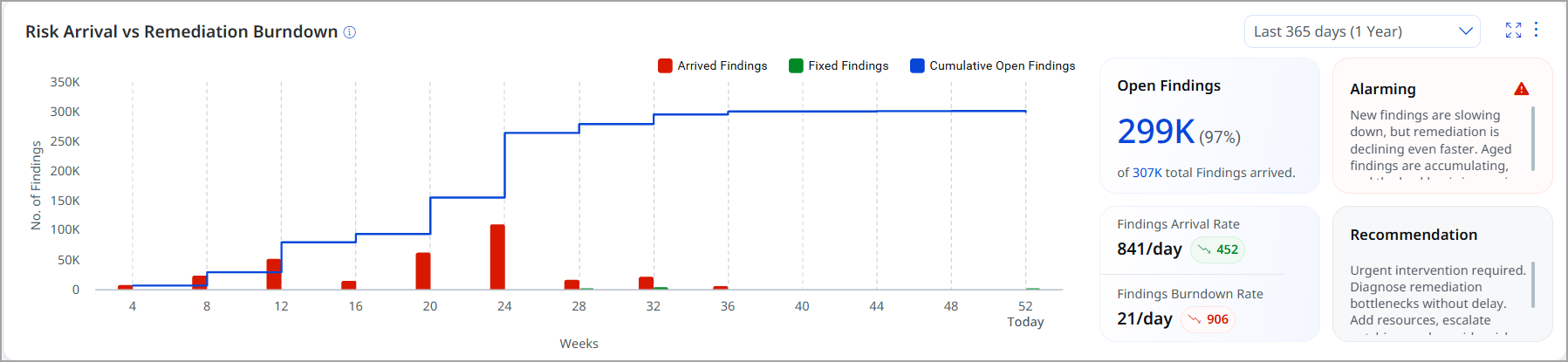
Operational Value and Insights
Here are some insights on using widgets:
- Provides clear visibility into how quickly new findings are entering the environment
- Compares arrival rates with remediation velocity to measure performance
- Helps identify backlog buildup early to prevent risk accumulation
- Delivers actionable trend insights to support data-driven security decisions
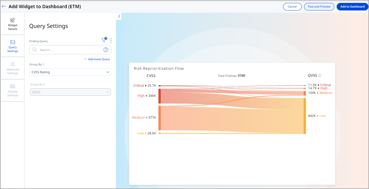
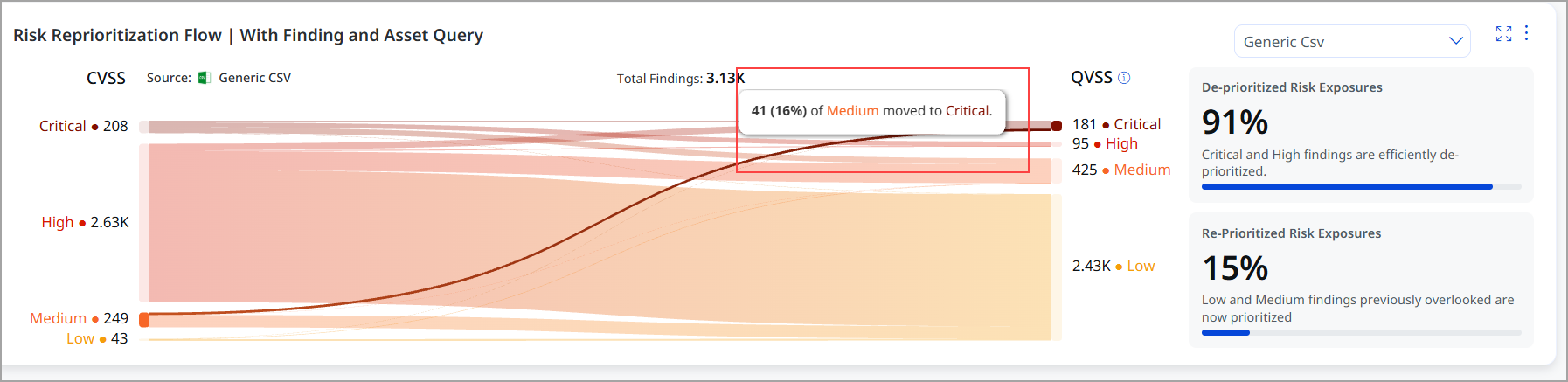
Risk Reprioritization Flow Widget Represented by Sankey Chart
The Risk Reprioritization Flow widget is a new dashboard visualization that helps security teams understand how vulnerability findings move between different risk scoring models. It visually represents how findings are deprioritized or reprioritized when moving from traditional scoring (such as CVSS or source-provided risk scores) to Qualys driven QVSS.
By showing the flow of findings between risk categories, the widget highlights how Qualys Insights reduces noise while surfacing vulnerabilities that truly matter.
A Sankey chart is an industry-standard visualization used to show the flow of items from one state to another.
In this widget:
- Nodes represent risk severity buckets (Critical, High, Medium, Low).
- Links represent how findings move from one severity bucket to another.
- Link width indicates the number of findings flowing between buckets.
- Colors represent severity levels and transitions.
Key Objectives of the Widget
The Risk Reprioritization Flow widget helps you:
- Reduce vulnerability noise by showing findings that can be safely deprioritized
- Identify hidden risk where low or medium findings are reprioritized as higher risk
- Compare traditional scoring models with Qualys’ intelligence-driven QVSS
- Focus remediation efforts on what truly requires attention
To add the widget to your dashboard, navigate to Dashboard, click Add Widget, and select Risk Reprioritization Flow from available ETM widgets. Enter your queries, customize the widget, widget starts showing in your dashboard.
The following image illustrates how the QVSS-based scoring system has downgraded 46% of critical findings to medium priority. This allows your organization to reduce vulnerability noise by highlighting only those findings that can be safely deprioritized. Overall, 91% of findings are effectively downgraded, enabling you to focus your remediation efforts on the issues that truly require attention.
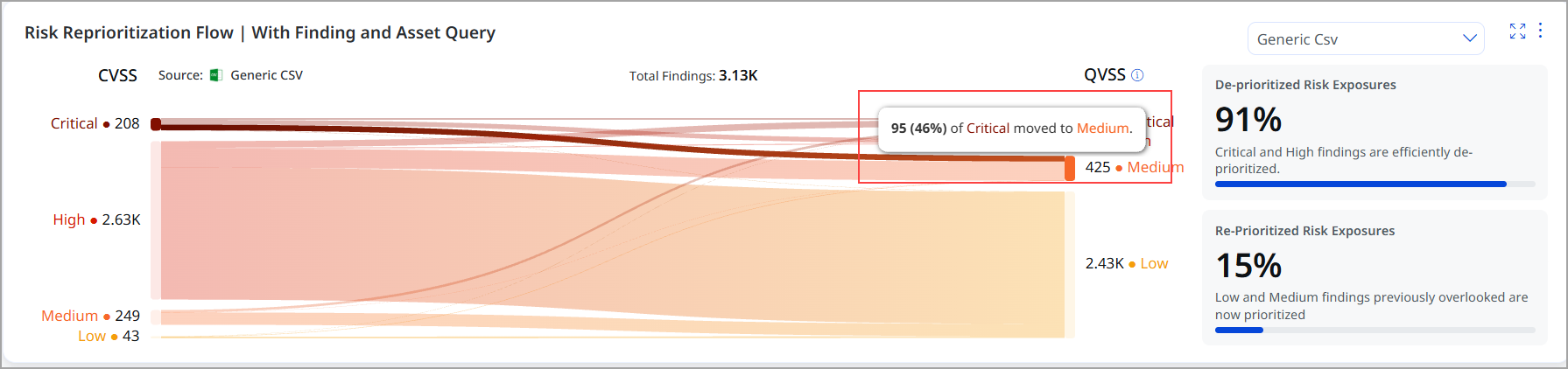
The following image illustrates that 16% of medium findings have been escalated to critical status. Overall, 15% of low and medium findings were re-prioritized. This highlights the importance of focusing remediation efforts on issues that truly require attention.
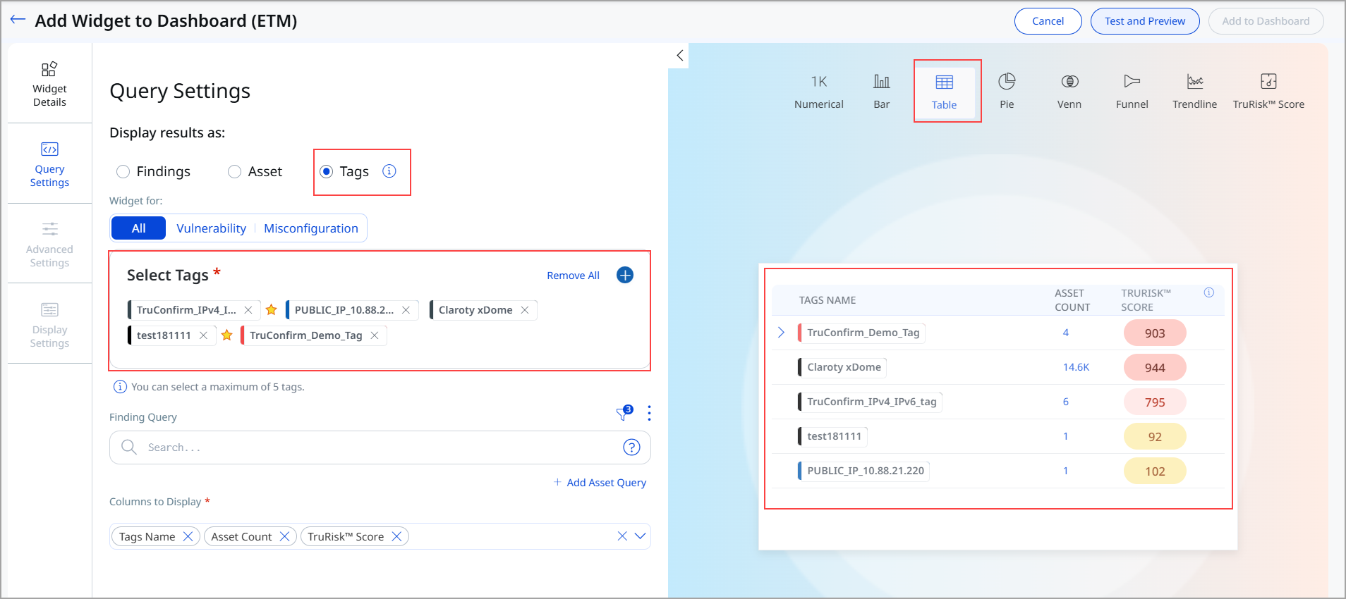
Tag-Based Widget
The Tag-Based Widget is a visualization component that enables viewing and analyzing security findings organized by tags.
The benefits of the widget include:
- Tag-based widget for dashboard analytics and reporting
- Support for multi-level tag hierarchies with expandable parent-child relationships
- Flexible column configuration for customized data display
- Integration with access control to restrict data based on user permissions
Key Features of Tag-Based Widget
Here are the primary features of the Tag‑Based Widget:
- Select up to 5 tags for display in a single widget
- View aggregated data, including tag name, asset count, risk score, and vulnerability count
- Expand parent tags to reveal child tag relationships
- Apply custom filters to findings and assets
- Navigate to risk management views with contextual data filters
To add the widget to your dashboard, navigate to Dashboard, click Add Widget, and Build your Widget.
We have added Tags as the new option to display results for the Table Widget. This option helps generate your query results based on Tags. You can use this option to generate collated data for Asset Count, TruRisk™ Score, and Vuln Count. To access this option, you must have Add Tag or Remove Tag permissions enabled from the Administration application.