UI 4.0 Release Notification
May 06, 2025
What’s New in the UI 4.0 Rollout Plan
Phase 3 – Full Transition to UI 4.0
Following positive feedback from customers in Phase 2, we are proceeding with Phase 3 of the UI 4.0 rollout.
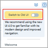
You will now automatically log into the new interface (UI 4.0) that offers a modern, streamlined, and consistent experience across the platform. As part of this transition, the option to switch back to the old UI will be retired.
No user action is required, and the transition is seamless with no expected impact on workflows.
Previously Announced Phases
Phase 2 - UI 4.0 Set as Default with Toggle Option
In Phase 2 of the UI 4.0 rollout, the new interface became the default option upon logging in. If you were not ready to use the new interface, you still had the option to switch back to the familiar old UI.
Phase 1 - UI 4.0 Available for Early Access
In Phase 1 of the UI 4.0 rollout, launched in late January 2025, you were prompted to switch to the newly designed interface upon login.
This update introduced a consistent and streamlined experience across all applications, making navigation and functionality more intuitive than ever.
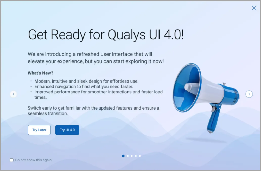
Enhanced UI 4.0
Introducing the new and improved UI with the following key upgrades. This new interface is designed to make your platform experience faster, smoother.
Check out our blog for insights to discover the key enhancements designed to improve your experience.
Watch this video to explore the new UI and discover the key enhancements designed to improve your experience!
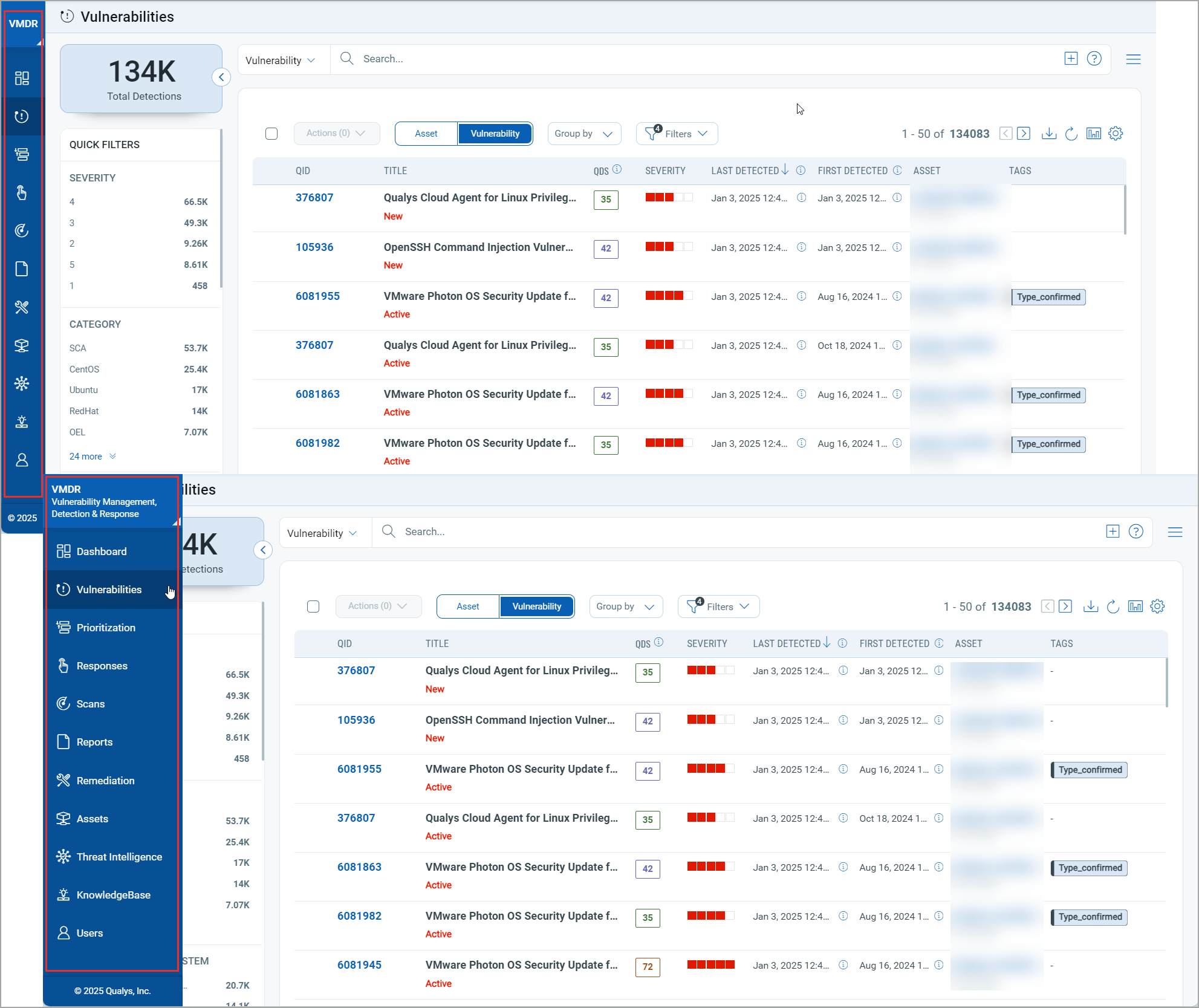
New UI Key Highlights
The vertical navigation bar on the left side of your screen offers quick access to modules, keeping your workspace organized. Use the toggle icon in the top-left corner to dock or undock the bar and to show or hide icon labels as needed.
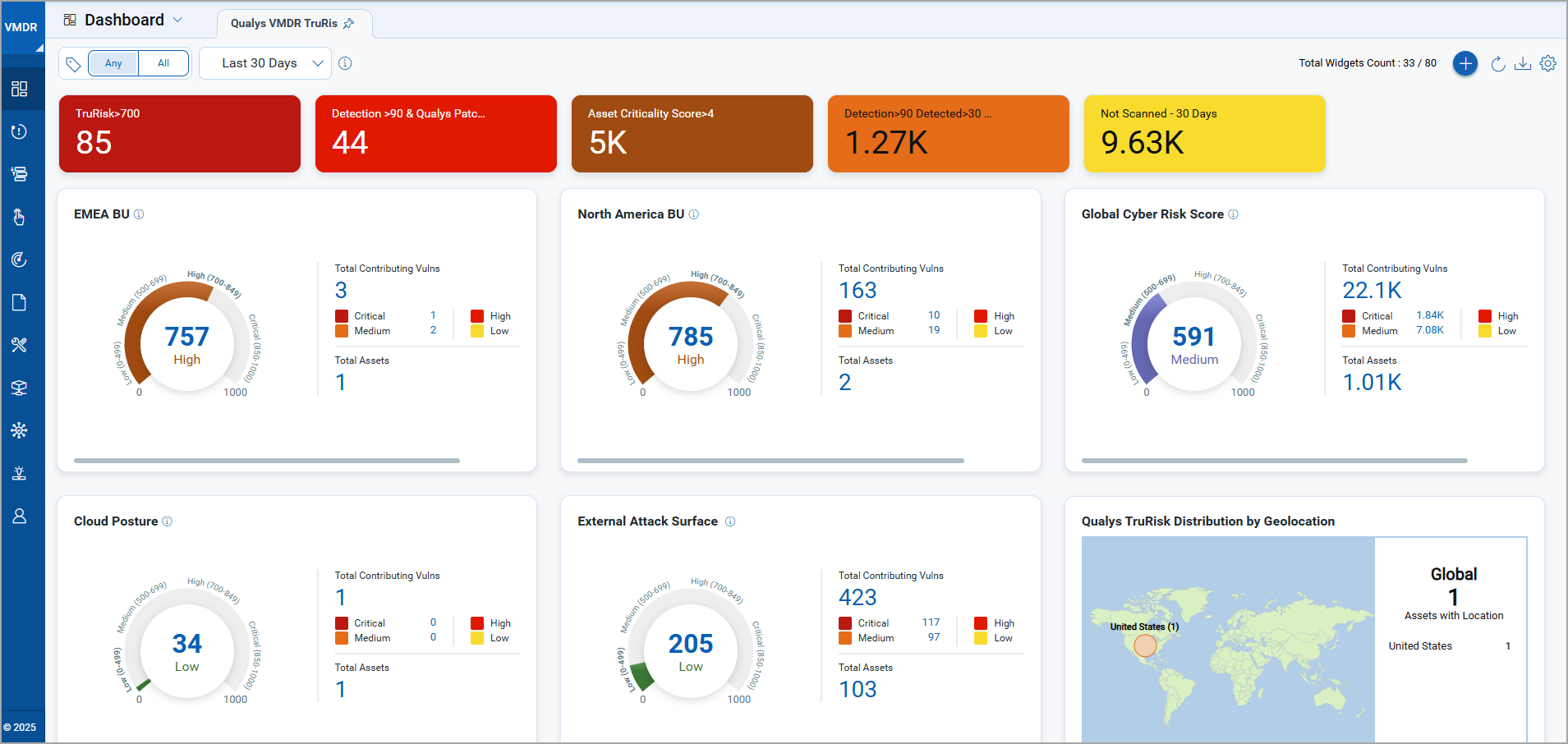
Refreshed DashboardsRefreshed Dashboards
We have improved our dashboards for better accessibility, color scheme, typography, and data interpretation. These updates ensure easy information consumption for all users.
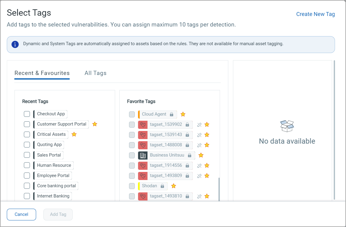
Standardized UI Elements for Seamless NavigationStandardized UI Elements for Seamless Navigation
We have standardized the look and feel across all modules to enhance usability and ease of transition, reducing the learning curve for a more intuitive experience.
For example, here’s our redesigned Select Tags window with improved UI components.
The Communication tab has been reorganized for better usability, with clear sections to help you quickly find important information.
| Notifications Section – This section focuses on items requiring immediate attention and follow-up. | 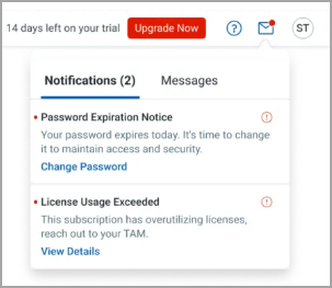 |
| Messages Section – This section delivers general updates and information from the platform. | 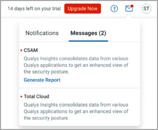 |
New UI Rollout
We are rolling out our newly designed user interface (UI) for the entire platform starting in the latter half of January 2025! This update introduces a consistent and streamlined experience across all applications simultaneously, ensuring that navigation and functionality are more intuitive than ever.
As part of this transition, when you log into your account, you will see a prompt to switch to the new UI. The rollout is designed to be seamless, ensuring all users enjoy the enhanced experience without interruptions.
To stay updated on the rollout schedule:
- Subscribe to Qualys Status for real-time updates.
- Keep an eye out for in-platform notifications that will guide you through the transition.
For more detailed information on the rollout timeline and transition plan, we encourage you to check out our blog.
You can update your preference by switching between the Old and New UI using the toggle option until Day 90.
If no preference is set, the platform will default to the New UI after the 30 days transition period. For more information on the rollout phase, refer to the Frequently Asked Questions.