Unified Dashboard Release 2.15
August 03, 2026
Download JSON for Scheduled Dashboard Reports
You can now download scheduled Unified Dashboard (UD) reports in JSON format, along with the existing PDF formats. This makes it easier to use your dashboard data in other tools.
Earlier, you could only download scheduled dashboard reports as PDFs. The new JSON format gives you the same dashboard data in a structured file.
You can select JSON as the report format on the Create Reporting Schedule page under the Report Schedule tab.
The JSON format works with all the other reporting options:
- Schedule Report: Run Now, Single Occurrence, or Recurring.
- Receive Report: As a URL or as an email Attachment.
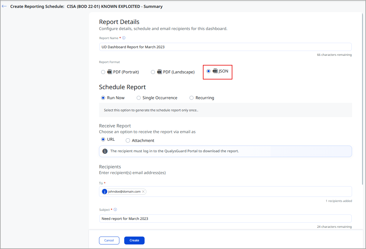
The JSON format option is currently available only for the Certificate View, Threat Protection, VMDR, ETM, and PA modules.
For more information, refer to UD Online Help.
Enhanced User Interface
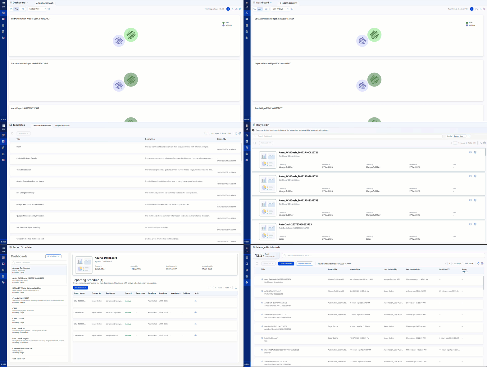
With this release, we have introduced an improved user experience across all UD pages. You can see updates across fonts, colors, typography, and buttons, making the interface more intuitive and easier to use. This release features User Interface and design system enhancements that improve visual consistency, readability, and usability across the application, resulting in a cleaner, more intuitive user experience.
Key benefits are:
- Cleaner, more consistent screens
- Easier-to-read and easier-to-understand text
- Important information stands out better, with less clutter
- Faster comprehension of risk, status, and numbers
User Interface Consistency and Clarity
Introducing the new and improved User Interface with the following key upgrades:
- Easier-to-read labels and text, with ALL CAPS replaced by sentence-style text
- Consistent text style for status and source names across the application
- Uniform text colors in tables, filters, page numbers, and tabs
- Aligned colors and text styles for tabs and page navigation throughout the application
- Clear visual indicators for buttons and options, showing active, inactive, or secondary states
- Better emphasis on important information, with subtle styling for less critical details to help users focus
Charts, Metrics, and Data Presentation
You can view the following updates:
- Updated chart color schemes for improved clarity and accessibility
- Compact, more readable numeric formats for better visibility
- Refined color gradients for risk scores and meters to enhance interpretation.
Issues Addressed
| Category/Component | Issues |
|---|---|
| UD - VMDR | We fixed an issue where dashboards were visible to users with limited privileges under the Frequently Used tab, even when those dashboards were outside their tag-based scope or RBAC permissions. Now, the Frequently Used tab applies RBAC and tag-based user scoping and displays only the dashboards the user has access to. |