Numerical Widgets
You can fetch data and display the count of mathematical operations in a numerical widget. You could also compare numbers with multiple queries. For example, you can view the count of malicious files, missing patches, or assets where patch installation is pending.
- Name: Provide a name for the widget. You could add a description for the widget that is displayed above the widget on the dashboard.
- Widget Representation (only for Vulnerability Management): Choose the count widget type to decide if the information to be presented in the count widget should be Regular or Summary.
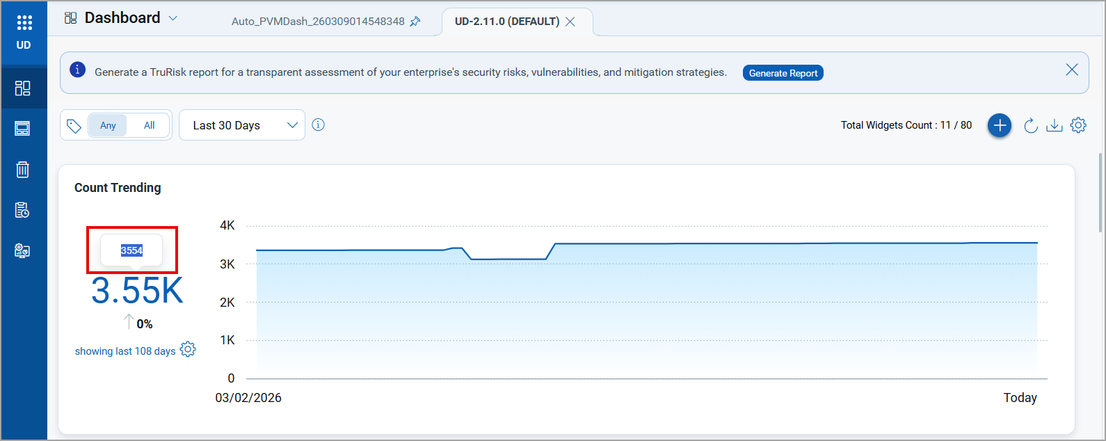
- Regular: Choose to create the regular-sized numerical widget. You can use the regular numerical widgets if you intend to display ratio or data trends for 90 days in the widget. The following screenshot is an example of Count Widget with Trending enabled:
-
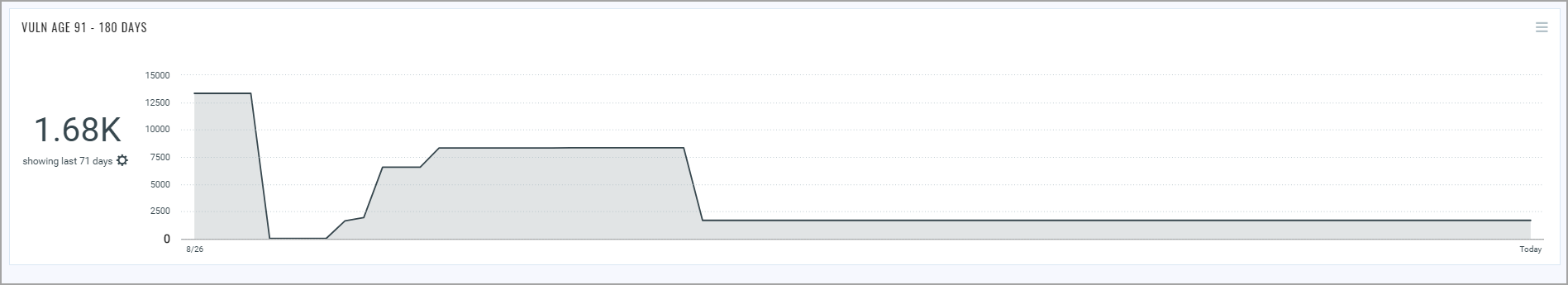
Summary: Choose to create a small-sized compact numerical widget. You can use compact widgets to accommodate more number of widgets and data in a dashboard. Because the widgets are compact, you cannot resize the widget.
The summary numerical widget displays trending as a comparison of data from the previous and today. If there is no change in data, the trend is displayed as 0 percent.The summary numerical widget is always positioned at the top of the dashboard. Editing the widget layout does not change the widget position.
- Regular: Choose to create the regular-sized numerical widget. You can use the regular numerical widgets if you intend to display ratio or data trends for 90 days in the widget. The following screenshot is an example of Count Widget with Trending enabled:
- Show Description on widget: Select the check box to display the widget description on the dashboard.
Types of Numerical Widgets (only for Regular Numerical widget): Choose numerical widget type to decide if the widget should display count or ratio.- Count: Choose to view data in the form of a number/count. You could also populate two queries to compare results. For more information, see Count Function Type.
- Ratio: (available only for Vulnerability Management) Choose to view the data in the form of a ratio. For more information, see Ratio Function Type.
- Average: (available only for Vulnerability Management) Choose to track the risk level for the number of days it took to close the vulnerability. For more information, see Average Function Type.
- Query for the data in widget: Type in your search query for the data to be populated in the widget. For information on search queries, refer to Search Tutorial.
Using the search action menu, you can view the frequently-used QQL queries, save, and manage them with ease. Looking for the different actions on the search queries, see Search Actions.
 - Advanced Settings: Enable Trending to view the trend data. Once enabled you can also color map the data from the Trendline Color Mapping section.
Trending is available for CSAM, EDR, TP and VM applications. Learn more about Trending - Display Settings: Configure the widget preferences, such as background color, and navigation for data points.
- Set Base Color: Define the background color to be used for the widget for quick identification.
- When clicked navigate to: Define the screen to be displayed when a user clicks on the widget. You could choose to display the data list screen, a specific dashboard, or a module.
- Widget Rules: You could define criteria in form of rules for the widget for any of the Function Type . For example, if you want the widget to alert you by a change in color when it meets a certain threshold, you could add a rule for the same. You can also define multiple criteria for the widget. If there are multiple rules defined for the widget and if the widget matches multiple rules, the last rule that meets the criteria is implemented.
- Scenario 1: Highlight the widget with green when it meets a certain threshold within a safe limit.
- Click Add Rule, click Equal to > custom value, and then enter the threshold value that you want to define. Select the color from the color picker. For example, green.
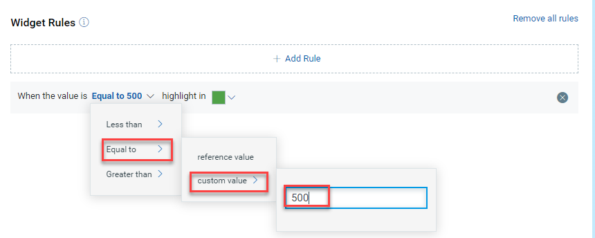
- Click Add Rule, click Equal to > custom value, and then enter the threshold value that you want to define. Select the color from the color picker. For example, green.
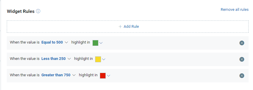
- Scenario 2: Add multiple criteria with multiple definitions to reflect the criteria through color.
- Click Add Rule, click Equal to > custom value, and then enter the threshold value that you want to define. Select the color from the color picker. For example, green.
- Click Add another rule, less than > custom value, and then enter the threshold value that you want to define. Select the color from the color picker. For example, yellow.
- Click Add another rule, greater than > custom value, and then enter the threshold value that you want to define. Select the color from the color picker. Following screenshot is an example of color selection from the color picker
- Scenario 1: Highlight the widget with green when it meets a certain threshold within a safe limit.
Copy Actual Numerical Values from Widget Tooltip
To copy the actual numeric value from a widget, perform the following steps:
- On the dashboard, locate the numerical widget on the dashboard from which you want to copy the numerical data from the tooltip.
- Hover on the numerical value in the widget.
- Select and copy the value directly from the tooltip.
- Paste it into an external tool, such as a spreadsheet, for further analysis or reporting.