Working with ETM Dashboard
You can use the default dashboard provided by Qualys or easily configure widgets and add them to your dashboard. You can also add as many dashboards as you like to customize your security posture view. For help on creating widgets, dashboards, templates and more, refer to the Unified Dashboard online help.
ETM Dashboard Widgets
When you add a new widget to your ETM dashboard, you see several options available for different widget types: Numerical, Bar, Table, Pie and TruRisk™ score. Here in this topic we show you a few examples below to help you get started.
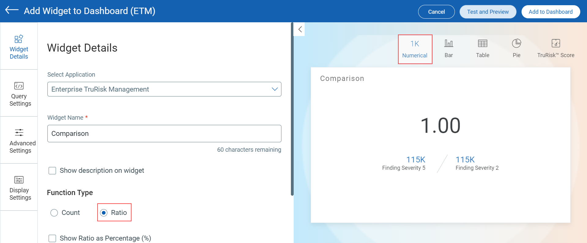
Ratio and Comparison for Numerical Widgets
Use the Ratio function type for a Numerical widget to compare two counts that could be retrieved from the search queries you provide for the widget. Define the search queries in Query Settings. Learn more.
The following image illustrates the widget configuration settings to visualize the comparison and ratio for vulnerability findings with severity 5 and 2:
 |
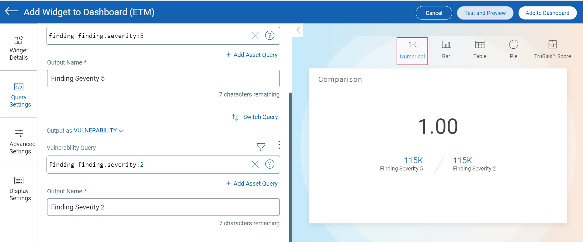 |
You can also add the Asset query for comparison. Switch between the Asset and Vulnerability query using ![]() .
.
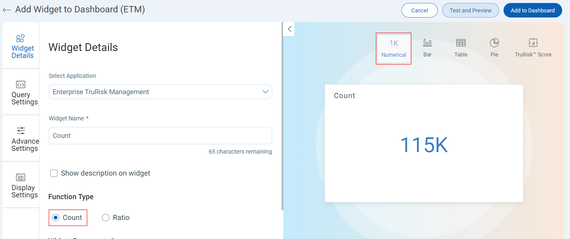
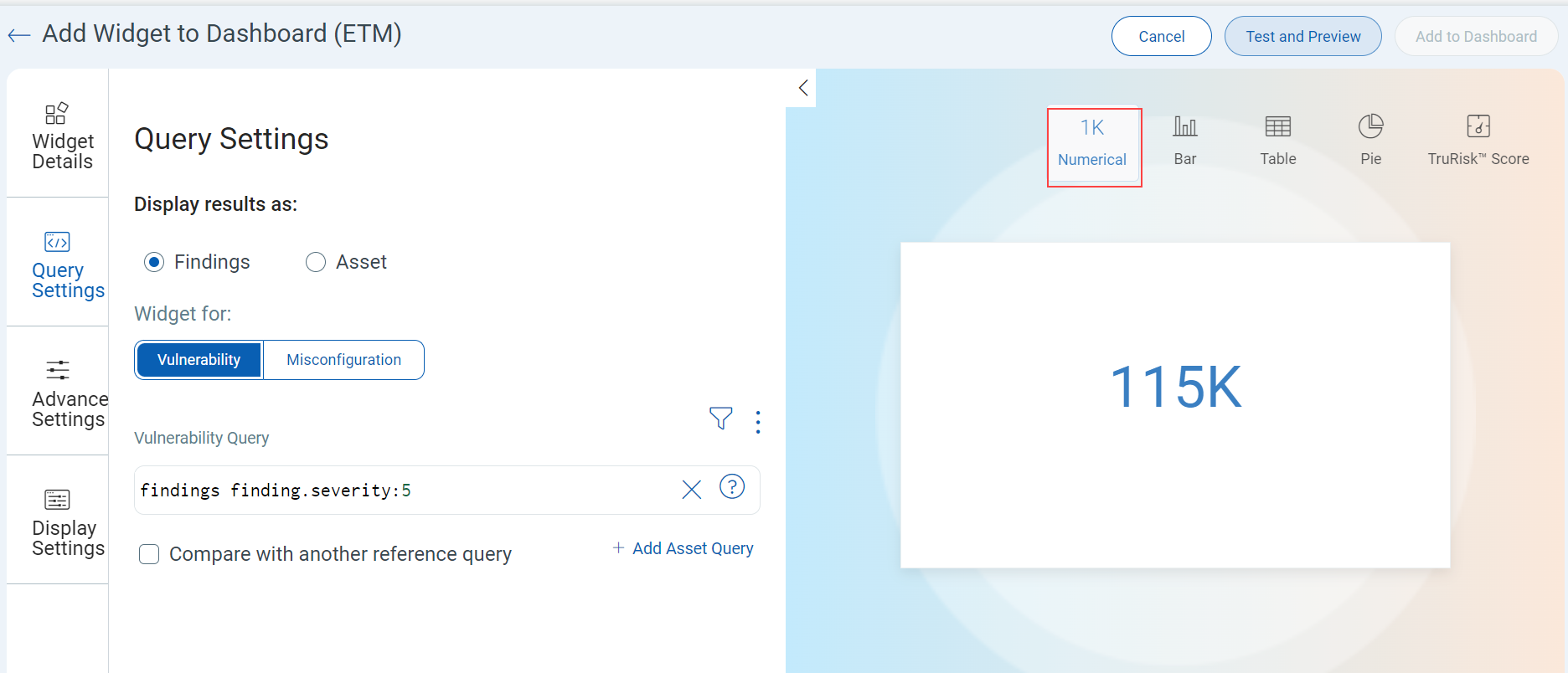
Count for Numerical Widget
Use the Count function type for a Numerical widget to visualize the outcome of a mathematical operation. Define the search queries in Query Settings. Learn more about Widgets.
The following image illustrates the count for numerical widget configuration settings to visualize vulnerability findings with severity 5:
 |
 |
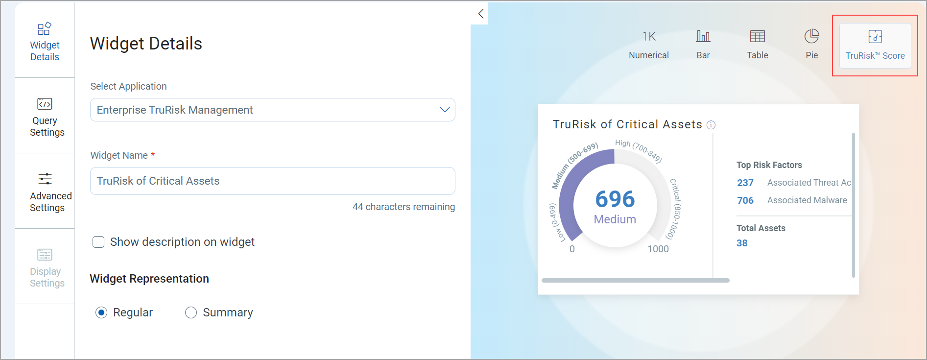
TruRisk™ Score Widget
Use the TruRisk™ Score widget to visualize the TruRisk™ score contributing factors. Click TruRisk™ Score in the right panel. Learn more about TruRisk™ Score Widget.
The following image illustrates TruRisk™ score widget configuration settings to visualize TruRisk™ score and its contributing factors:
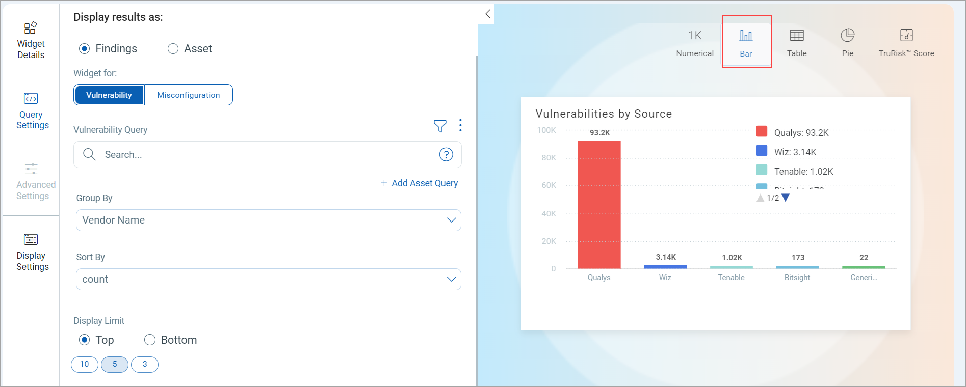
Bar and Pie Widget
Use the bar or pie widget to visualize the data in the form of a bar graph or pie chart. Define the search queries in Query Settings. Learn more about Pie Widget.
The following image illustrates a bar widget configuration settings to visualize the distribution of findings from various sources:
The following image illustrates the pie widget configuration settings to visualize the distribution of the findings from various sources:
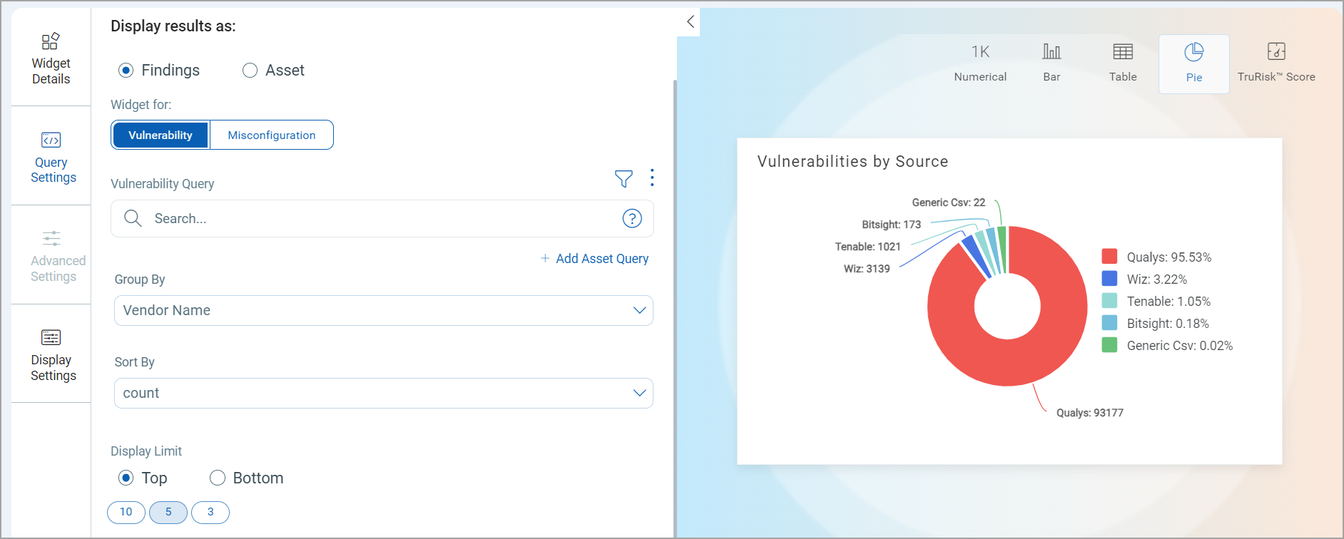
You can display the Pie widget as either a Donut or Simple Pie chart type by selecting the desired option in the Display settings while creating or editing the Pie widget.
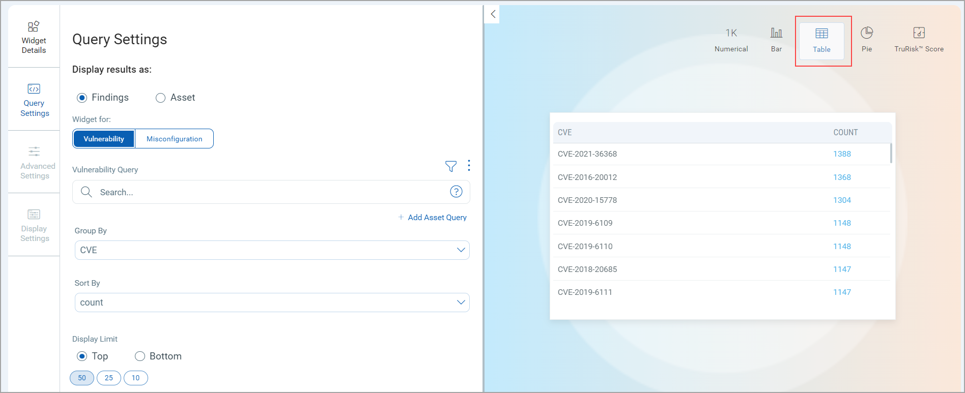
Table Widget
Use the table to visualize the data in the tabular form. Define the search queries in Query Settings. Learn more about Table Widget.
The following image illustrates a table widget configuration settings to visualize the distribution vulnerabilities based on CVE:
Dashboard Reporting and Scheduling
You can share dashboard-based reports via email with specific recipients by creating report schedules based on your preferred timezone and frequency (Daily, Weekly, or Monthly). The reports can be shared in PDF format with either Portrait or Landscape orientation. Learn more about Report Scheduling and Report Schedule.