Working with PA Dashboards
You can use the default dashboard provided by Qualys or easily configure widgets to pull information from other modules/applications and add them to your dashboard. You can also add as many dashboards as you like to customize your vulnerability posture view. For help on creating widgets, dashboards, templates, and more, refer to the Unified Dashboard Online Help.
Get Started with PA Dashboard
Go to the Qualys Policy Audit Dashboard to have a single-glance perspective into the overall compliance posture of all the assets in your subscription.
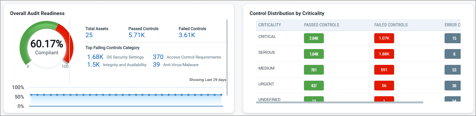
Leverage the powerful dashboarding capabilities to keep a close watch on any change in the asset posture across your environment, so that you can take immediate action to close potential security threats. For example, the following dashboard widget gives you an insight into the overall audit readiness based on the total number of passed and failed controls for total assets. Similarly, it also provides control distribution based on criticality, helping you identify controls that need immediate attention.
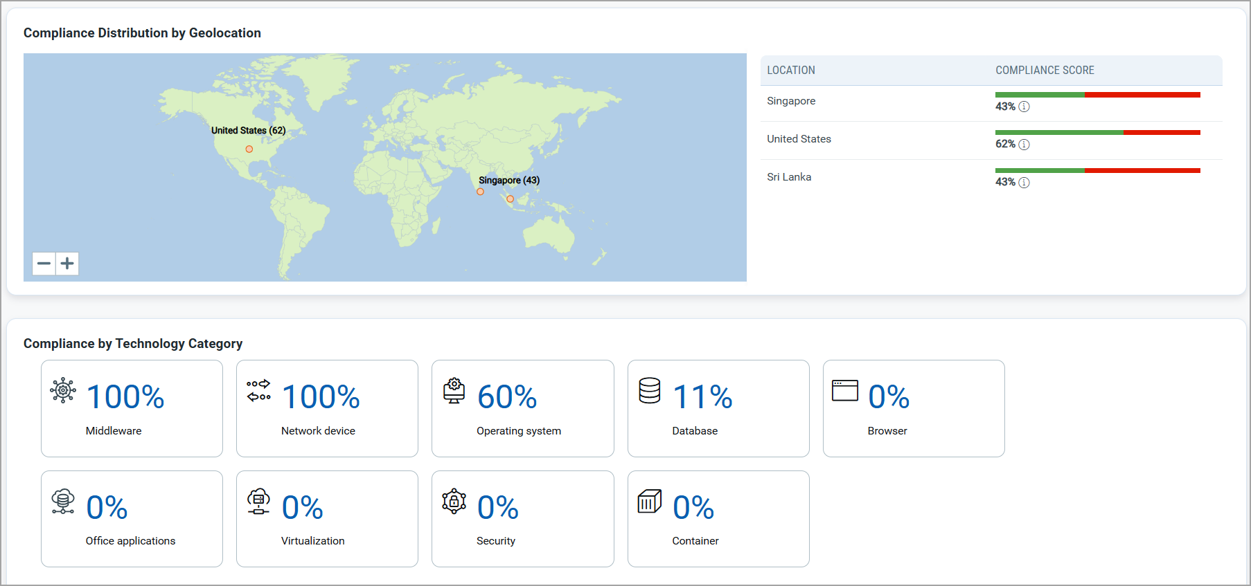
The PA dashboard is a central place to help you easily visualize compliance data along with key metrics. The following dashboard widget shows the complaince distribution based on geolocation and technology, thereby helping you with the much-needed details as per location and technology.
Adding Widgets to PA Dashboard
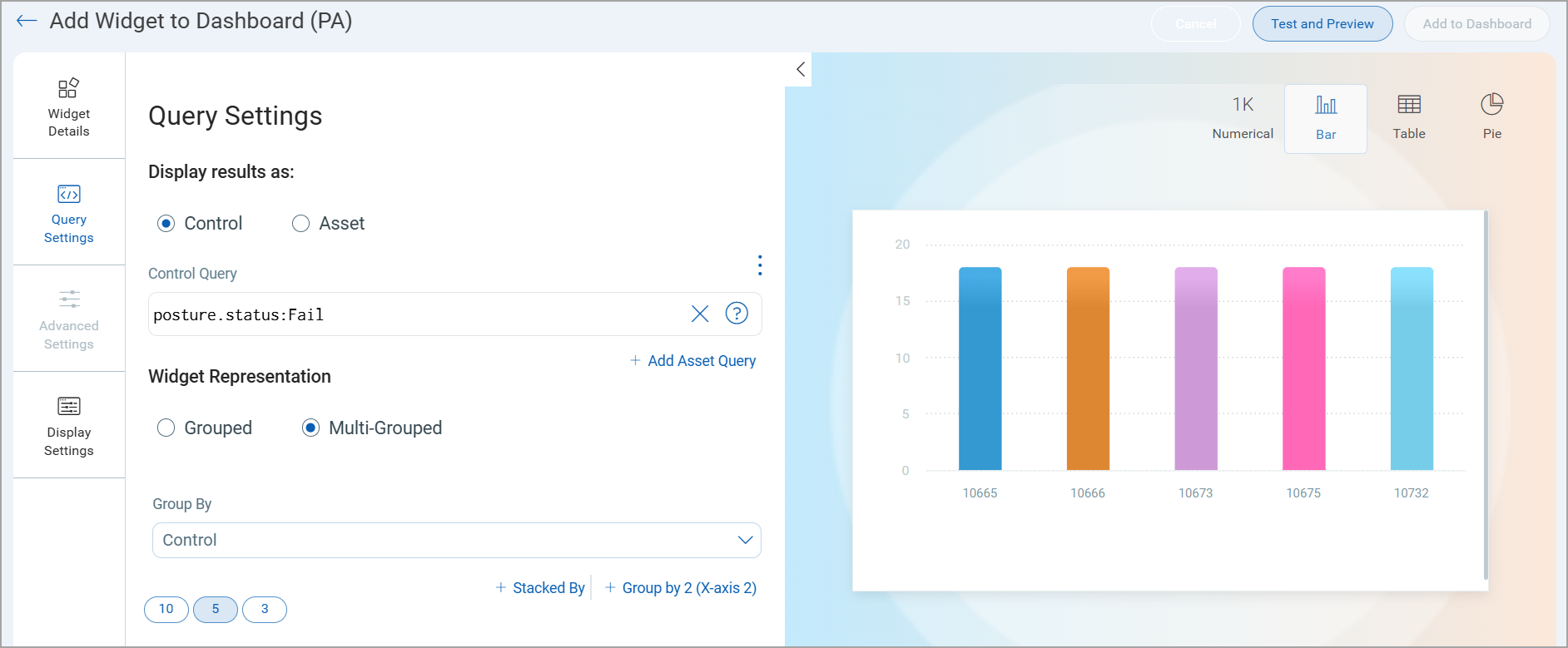
When you add a new widget to your PA Dashboard, you will see several options available for different widget types: Numerical, Bar, Table and Pie. We will show you a few examples below to help you get started.
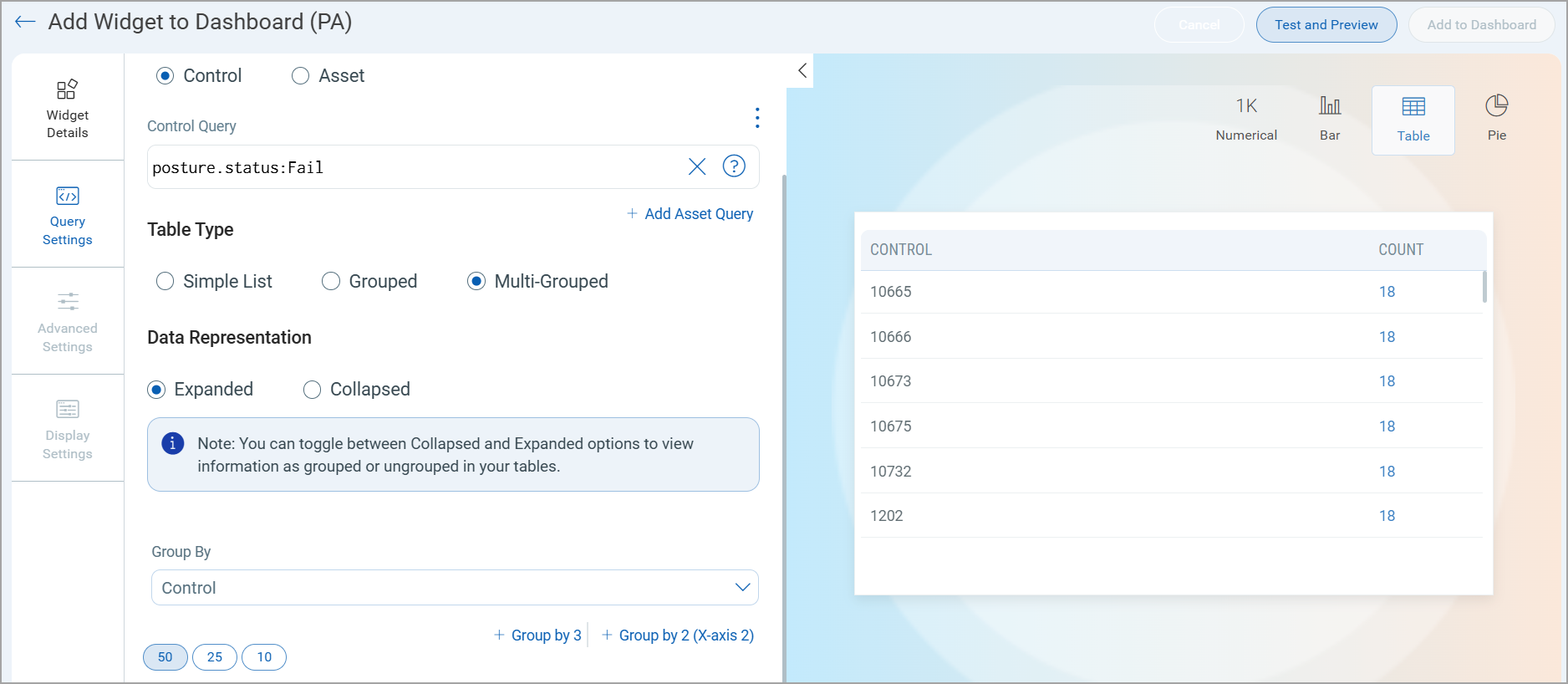
Multi-Grouped Option in Table and Bar Widgets
You will see Grouped and Multi-Grouped options for Table and Bar widgets to customize the data displayed on your widget.
Multi-Grouped Table Widget with Collapsed View

Multi-Grouped Table Widget with Expanded View
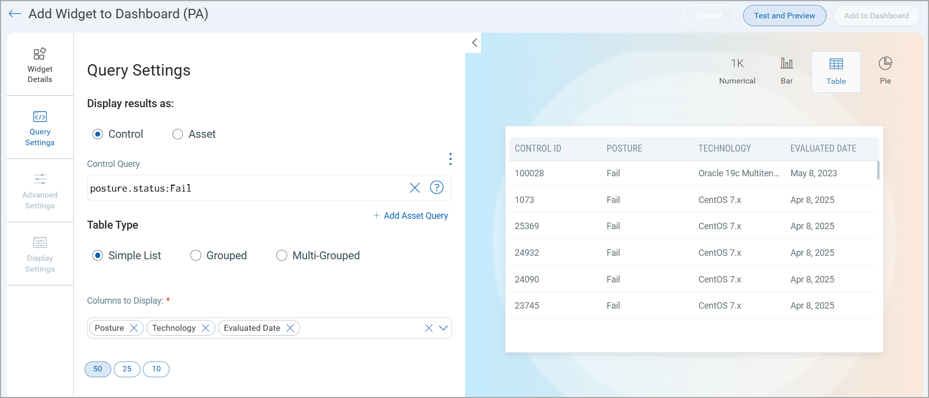
Simple List Table Type Widget
When adding a Table widget to your PA Dashboard, you can view the "Simple List" table type option. This is available whether you are displaying results by Control or by Asset. Choose the Simple List option under Table Type and then select the columns you want to display in the table.
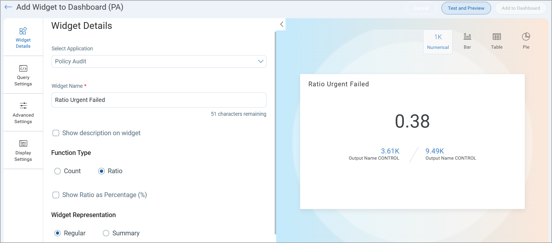
Ratio and Comparison for Numerical Widgets
Use the Ratio function type for a Numerical widget to compare two counts that could be retrieved from the search queries you provide for the widget. Define the search queries in Query Settings.
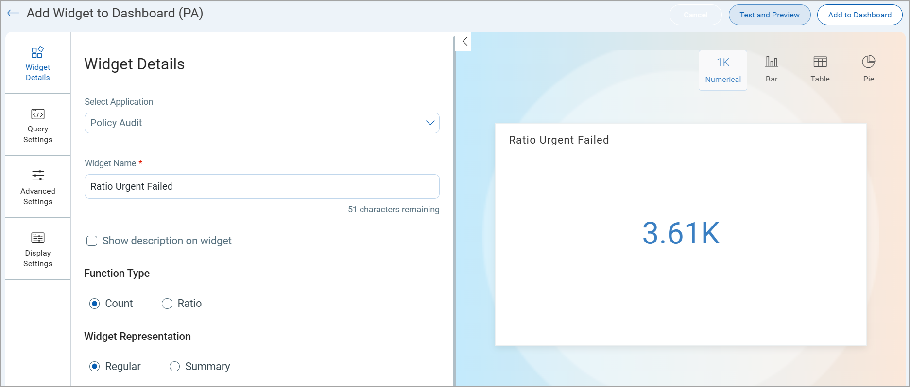
Use the Count function type for a Numerical widget to visualize the outcome of a mathematical operation. Define the search queries in Query Settings.
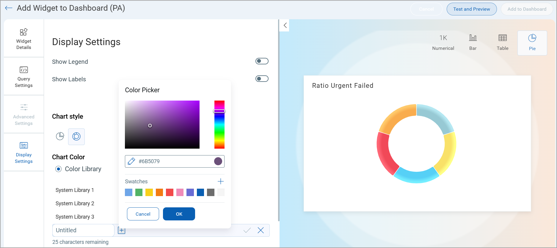
Use a Hex Code to Customize the Color Palette for a Widget
You can use a hex code in the color picker to customize the data displayed on a widget. you can view this option in the Display Settings.
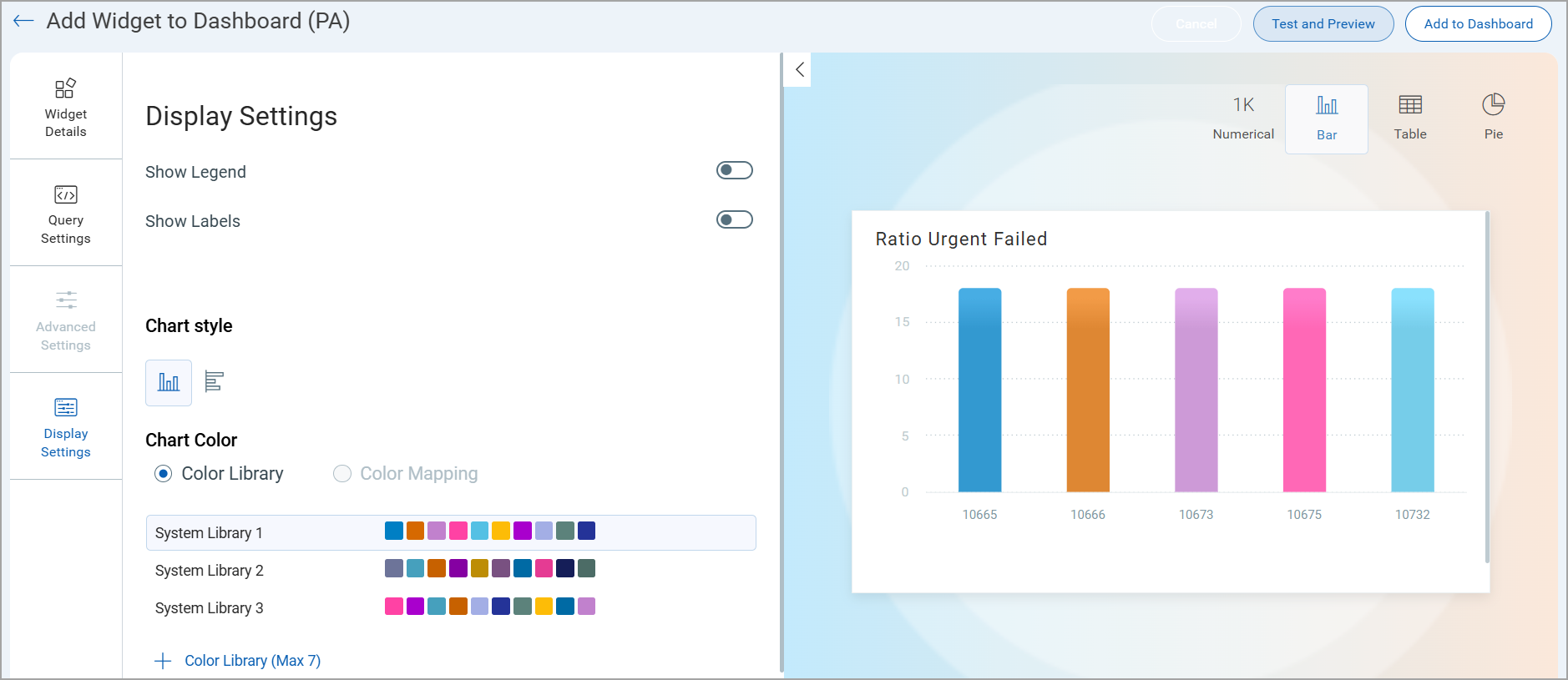
Color Mapping for Predefined Group By Values
For Bar and Pie type widgets, you can use the Color Library to assign custom color schemes for the data.
When you select one of the following tokens from the Group By menu (under Query Settings) for your widget, then you can customize the color mapping for the predefined values of the selected token.
|
Display Results As |
Group By |
|
Control |
Control Category, Control Subcategory, Exception Status, Posture, Posture Sub Status, Technology Category, Technology Sub-category |
|
Asset |
Tracking Method |
The Color Mapping option appears under Display Settings. This option is only available with the Group By options listed above.
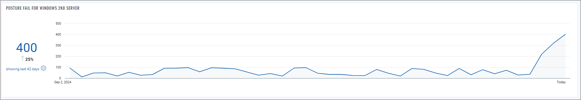
Trending
You can configure dashboard widgets to display trend data for up to 90 days. It is the analysis of data over a period of time to identify patterns, movements, or changes that indicate a direction or tendency It helps in understanding how specific metrics or behaviors are evolving, enabling informed decision-making and forecasting.
We have added an option to enable trending while creating/editing a widget. While creating or editing the widget, you can switch the Trending toggle on to view the data trend of the inputs you provide in your query. This toggle is only available for the Count and Ratio function type of the Numerical widget. You can also create a trend data comparison widget using multiple queries. Depending on the various combinations of data lists you choose, you could build different numerical widgets. Learn more about trending.
The image below shows the Trending toggle:
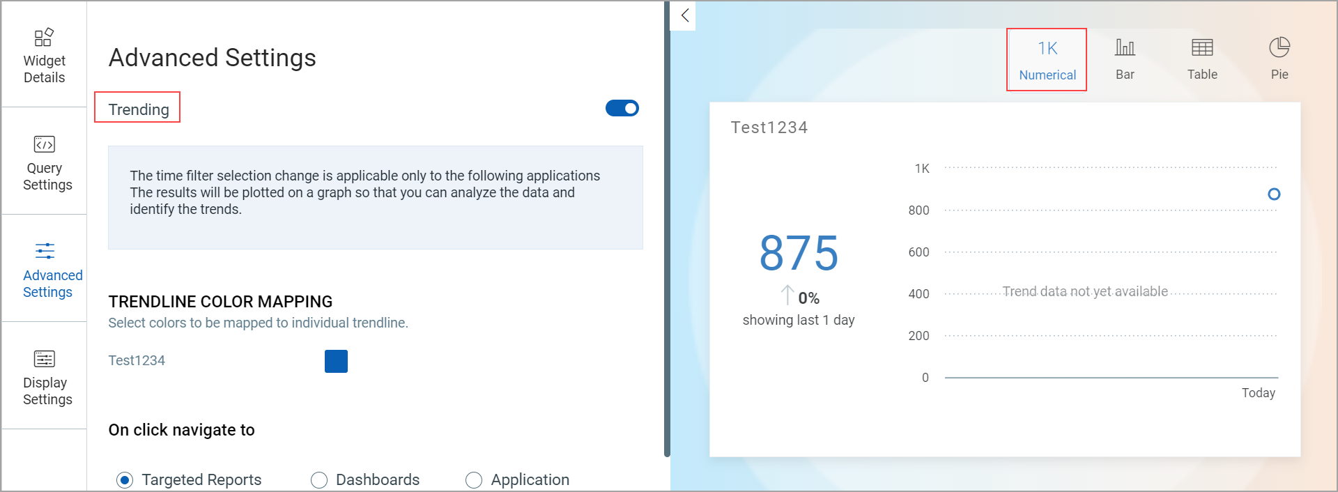
The following image illustrates how the Trending widget looks:
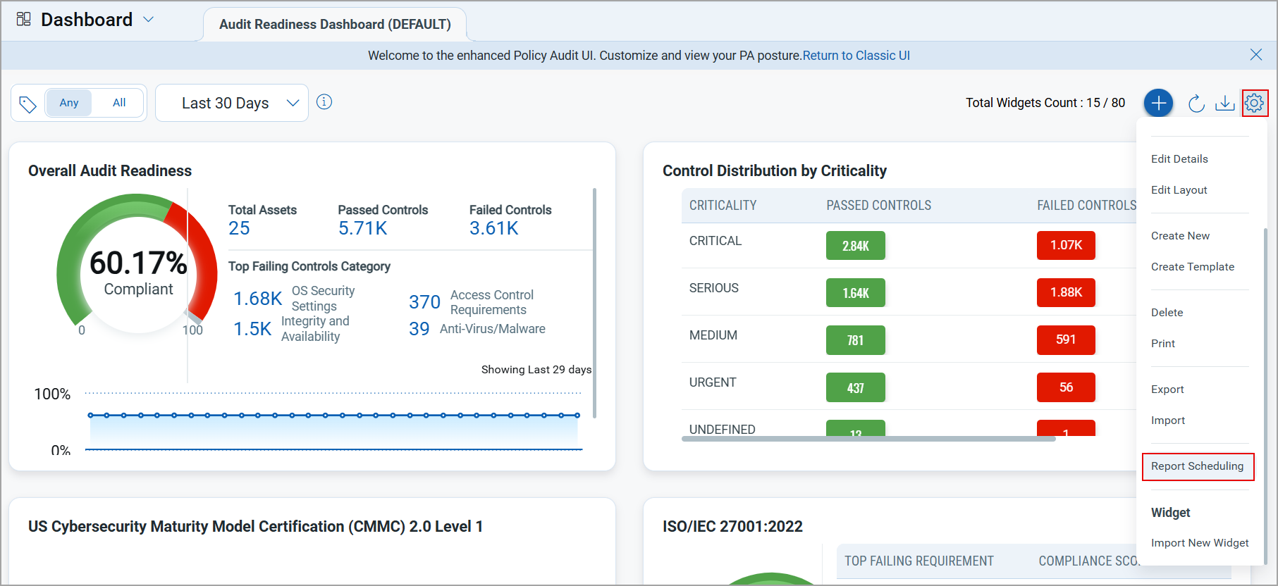
Report Scheduling
You can now share dashboard-based reports via email with specific recipients by creating report schedules based on your preferred timezone and frequency (Daily, Weekly, or Monthly). The reports can be shared in PDF format with either Portrait or Landscape orientation. Learn more.
This feature requires PCUI 1.4.2 and UD 1.16.4. If UD 1.16.4 is not available, then the dashboard widgets with trending enabled are shown in the report without any trending data. The widgets display a message: "no data to display."
This feature supports the following specific widget types:
- Numerical (Count and Ration function type)
- Bar
- Pie/Donut